


Decide Before You Open a Tin
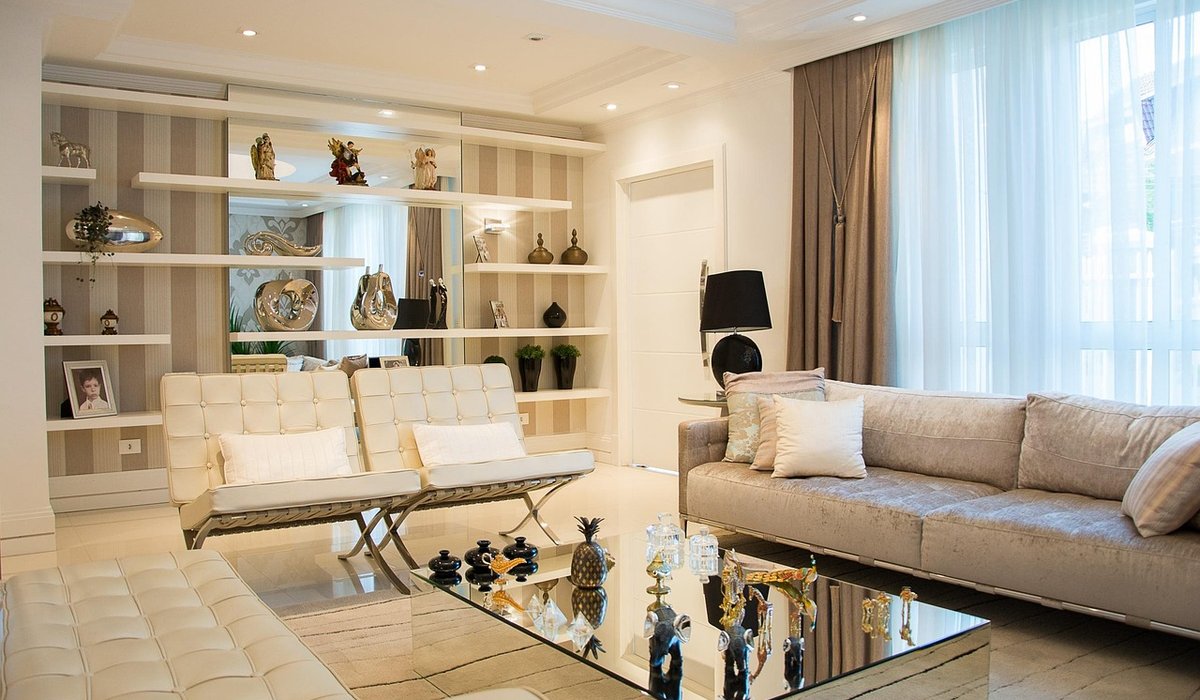
Shelves are one of the quietest things in a room, yet they do a lot of visual work. They hold your books, your ceramics, your half-finished candle collection — but they also draw lines across a wall, and those lines can either settle a space or become its boldest feature. Before you buy paint, ask yourself a simple question: do I want the shelves to blend into the wall, or to stand out against it?
There is no universally correct answer. Matching suits some rooms, contrast suits others, and both can look wonderful when the finish has been chosen with a bit of thought. What follows is a practical way to work through the decision, from colour through to the last coat of eggshell.
Matching for a Seamless, Considered Look
When shelves and walls share the same colour, the wall reads as one continuous surface and the objects on the shelves appear to float. It is a calm, tailored effect and it works beautifully in small rooms, narrow hallways, alcoves and chimney-breast recesses, where bulky joinery could otherwise feel oppressive.
It is also the most forgiving choice if your shelves are packed with books and everyday clutter. When the shelf itself disappears, the eye is left with the contents rather than the structure.
- Use the same colour in a harder-wearing finish. A water-based eggshell in your wall colour will read as a match but resist scuffs far better than matt emulsion.
- Go one shade deeper for depth. A tone slightly darker than the wall keeps the seamless feel while giving shelves a little definition.
- Keep the ceiling and trim in mind. If your walls are a soft off-white, matching shelves will blend into the architecture rather than competing with it.
The one risk is flatness. If everything is the same colour, the eye needs something to catch on — texture, a woven basket, a warm brass object, or a lampshade in a contrasting tone.
Contrast for a Focal Point
A shelf painted in a colour that deliberately differs from the wall becomes an instant feature. This is the approach to take when your shelf is the star of the room, or when a plain wall needs a bit of backbone.
The contrast does not have to be dramatic. A deep charcoal, forest green or warm ochre against pale plaster is striking without shouting. Even a subtle shift — off-white shelves on a grey wall — creates just enough separation to give the shelving presence.
- Dark shelves on light walls add weight and frame the objects on them beautifully.
- Light shelves on dark walls feel crisp and modern, and are ideal in a north-facing room that needs brightening.
- Paint the back panel, not the whole shelf. A contrasting back is a low-commitment way to introduce colour and makes pale objects pop.
- Colour the front edge only. A slim line of colour along the shelf face is a neat, understated trick.
Remember that strong colours show dust and fingerprints more readily, so a wipeable finish matters here.
Finish Matters as Much as Colour
Two shelves in the same colour can look completely different depending on their sheen. As a rule of thumb:
- Matt and chalk-style finishes feel soft, rustic and contemporary. They suit pale, muted shades and rooms with a relaxed mood, but they mark easily.
- Eggshell is the reliable middle ground — a gentle sheen that is hard-wearing and easy to clean.
- Satin has a soft glow and a modern feel. Excellent for kitchens and utility spaces.
- Gloss is durable and reflective, but it highlights every imperfection in the wood and can look dated in a living room.
If your shelves are solid timber with a lovely grain, consider a stain or a tinted oil instead of paint — you keep the texture and still control the colour.
Prep, Paint and Practicalities
Good preparation is what separates a professional-looking shelf from a patchy one. Remove the shelves if you can, label the fixings, and work on them flat.
- Fill old screw holes with a fine filler, then sand smooth.
- Sand bare or previously glossed wood with 120-grit, then finish with 180 to 240-grit for a smooth base.
- Wipe away dust with a damp cloth and let the surface dry fully.
- Seal knots in pine with a knotting solution to stop resin bleeding through.
- Apply a primer or bonding primer, especially over bare wood or old varnish.
- Finish with two thin coats rather than one thick one, sanding lightly between them.
Water-based paints usually need around four hours between coats; oil-based products need far longer. Always check the tin.
Test the Colour in Your Own Light
Paint looks different in every room. A soft grey can turn blue in a north-facing space and warm to greige in a sunny one. Before committing, paint a sample onto a piece of card or a spare offcut of wood and move it around the room through the day — morning light, afternoon sun, and the glow of an evening lamp. Live with it for a few days. Once you are happy, the job itself is an afternoon's work, and you will be left with shelving that looks deliberately designed rather than simply installed.


Leave a reply